How to Create Effective Visual Materials for Self-Directed Learning
Self-directed learning has become a cornerstone of modern education, offering individuals the flexibility to learn at their own pace and on their own terms. One of the most effective ways to support this type of learning is through the use of well-designed visual materials. These resources can not only aid in understanding complex concepts but also make learning more engaging and interactive. In this article, we’ll explore the importance of visual materials, how to create them effectively, and the best practices for incorporating them into self-study routines.
The Importance of Visual Materials in Self-Directed Learning
Visual materials play a crucial role in the self-learning process. They help learners to better comprehend abstract or difficult concepts by transforming information into easily digestible formats. When used correctly, visual aids such as charts, diagrams, infographics, and mind maps can clarify complex ideas, making them more accessible and easier to remember.
Moreover, visual learning caters to different types of learners. According to educational research, individuals process visual information differently than auditory or kinesthetic information. While some learners may thrive from hearing lectures, others may need to see information presented in a visual format to grasp the material more effectively. By incorporating visual materials into a learning strategy, you can ensure that you appeal to various learning styles, thus improving retention and understanding.
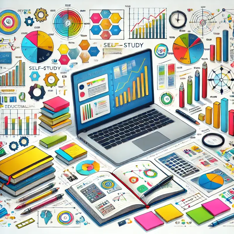
Key Types of Visual Materials for Learning
There are several types of visual materials that can be created and utilized to enhance self-directed learning. Below, we’ll examine the most effective visual tools, their applications, and how to create them:
-
Infographics
Infographics are one of the most powerful visual tools for summarizing complex information. They combine text, images, and data in a way that makes it easy to grasp the key points of a topic. Infographics are particularly useful for presenting statistical data, timelines, or processes that need to be broken down into manageable chunks.- Tip for Creating Infographics: Use a clean, organized layout with consistent fonts and color schemes. Make sure the information flows logically and avoid overwhelming the viewer with too much detail.
-
Mind Maps
Mind maps are a great tool for brainstorming and organizing information. They visually represent the connections between ideas and concepts, helping learners understand how different pieces of information fit together. Mind maps are particularly useful for planning projects, outlining essays, or studying for exams.- Tip for Creating Mind Maps: Start with a central idea in the middle of the page and branch out into related topics. Use color and images to make the map more engaging, and keep the connections clear and concise.
-
Diagrams and Flowcharts
Diagrams and flowcharts are essential for explaining processes, systems, or relationships between concepts. They provide a visual representation of steps or stages, making it easier to follow along. Flowcharts are particularly useful for illustrating decision-making processes or cause-and-effect relationships.- Tip for Creating Diagrams: Keep the shapes and lines consistent, and ensure that arrows and labels clearly indicate the sequence or relationship between elements.
-
Charts and Graphs
Charts and graphs are used to represent numerical data in a visual format. They allow learners to quickly identify trends, comparisons, or relationships between data points. Pie charts, bar graphs, and line graphs are common examples that can simplify the analysis of quantitative information.- Tip for Creating Charts and Graphs: Choose the right type of chart based on the data you’re presenting (e.g., use a bar graph for comparisons and a line graph for trends over time). Ensure the axes are labeled clearly and the data is easy to interpret.
-
Flashcards
Flashcards are a time-tested tool for memorization. They are simple, yet effective in helping learners retain information through repetitive review. Visual flashcards, which include images alongside text, can improve memory recall by providing visual cues.- Tip for Creating Flashcards: Use images that are directly related to the content on the card. Keep the text minimal and ensure that the visuals reinforce the message you want to convey.
Principles of Effective Visual Design
When creating visual materials, it’s important to keep in mind several key principles of effective design. These principles will help ensure that your visuals are not only aesthetically pleasing but also functional and easy to understand. Below are some essential design guidelines:
-
Clarity and Simplicity
The main goal of visual materials is to simplify complex ideas, so avoid cluttering your visuals with excessive text, images, or colors. Keep the design clean and simple, with a clear focal point. Ensure that every element serves a purpose in conveying the intended message. -
Consistency
Consistency in design helps make your visuals easier to navigate. Use the same fonts, colors, and shapes throughout your materials to create a cohesive look. Consistent use of visual elements also ensures that learners can easily recognize and understand different types of information. -
Use of Color
Color can be a powerful tool to enhance visual materials, but it must be used thoughtfully. Colors can be used to highlight key points, organize information into categories, or evoke certain emotions. However, too many colors can be distracting, so use a limited color palette to maintain focus. -
Legibility
Text should be easy to read, with clear fonts and appropriate sizing. Avoid using overly decorative fonts that may hinder readability. Ensure there’s enough contrast between text and background colors so that the information is visible even on smaller screens or in low-light conditions. -
Balance and Alignment
Proper alignment and balance of visual elements ensure that your materials look organized and are easy to follow. Make sure that text, images, and other components are aligned properly and that there’s enough space between elements to avoid visual clutter.